Have you ever noticed that some people simply radiate a sense of comfort and ease, not necessarily because of their physical appearance, but rather due to the aura they exude?
Color psychology suggests that our perception of someone’s likability and the positive feelings they evoke can be determined within just 7 seconds, with color accounting for a staggering 67% of that impression.
In this article, we’ll explore the most comfortable color combinations that can help you appear more approachable and lovable.
Morandi Color Palette
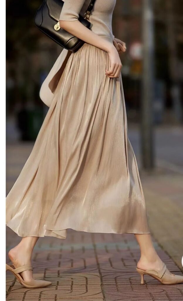

The soothing nature of the Morandi color palette lies in its subtle, muted tones. The interplay of these colors creates a visual balance that is both calming and harmonious. For example, pairing khaki with brown results in a gentle, comforting aesthetic.
The Morandi palette encompasses low-saturation greens, blues, yellows, and browns, all of which evoke a sense of tranquility and ease. It’s the skillful combination of these colors, rather than any single hue, that creates a feeling of comfort. The Morandi palette achieves this effortlessly.
Sophisticated Gray Tones
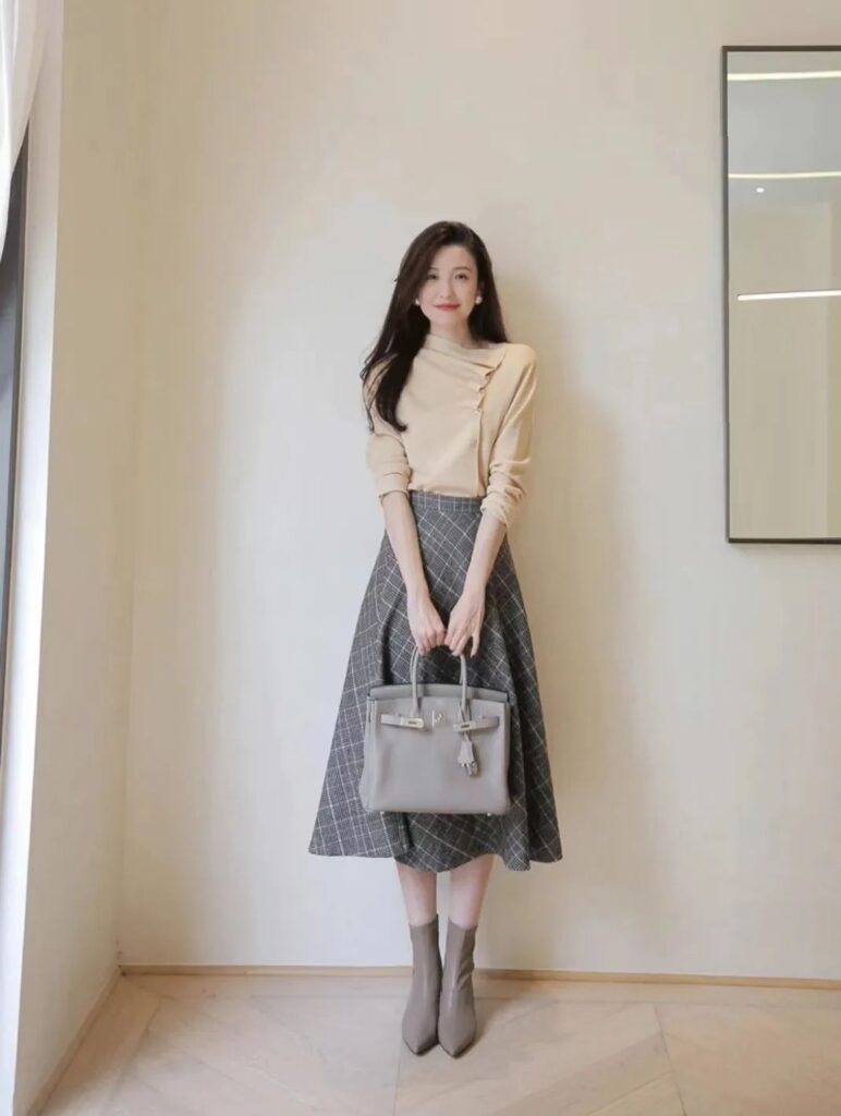

Gray, a neutral and achromatic color, embodies softness, elegance, and gentleness. As a trending color in fashion, gray offers a low-purity, subdued, and serene tone.
The combination of gray and white is timeless and eternally chic. When paired with red, a color associated with passion and boldness, gray’s calm and restrained nature creates a striking contrast that balances the visual experience.
Gray and blue, on the other hand, evoke a sense of tranquility. The refreshing blue, reminiscent of the vast ocean, when combined with the equally deep and sophisticated gray, instills a feeling of serenity.
Monochromatic Harmony
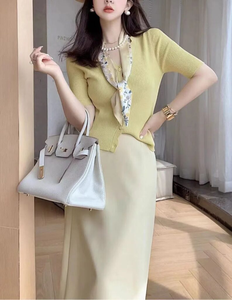
A monochromatic color scheme involves using different shades and tints of the same hue. For example, coral pink, baby pink, and magenta belong to the red family, while yellow-green, grass green, and olive green are part of the green family.
Dressing in a single color family, with varying degrees of lightness and darkness, creates a visually pleasing and harmonious appearance. This approach adds depth and dimension to an outfit while maintaining a cohesive, comfortable look.
Complementary Color Combinations
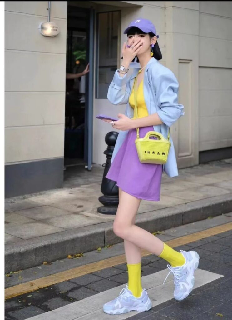
While some may find complementary colors visually jarring and uncomfortable, the key lies in selecting the right hues and proportions.
The classic combination of yellow and green, for instance, can be challenging. However, by opting for a low-saturation, muted green and pairing it with red, the result is surprisingly harmonious.
When creating complementary color outfits, it’s crucial to choose one color as the dominant hue and use the other as an accent. By keeping the accent color’s presence minimal, you maintain visual balance and avoid overwhelming the eye.
These four color palettes demonstrate how the right combinations can create a sense of comfort and ease in your personal style.
If you struggle with color matching, feel free to follow me for more advice.
With 15 years of color coordination experience, I have compiled 160 sets of sophisticated and comfortable color palettes that you can easily reference and apply to your outfits, eliminating any uncertainty in your color choices.